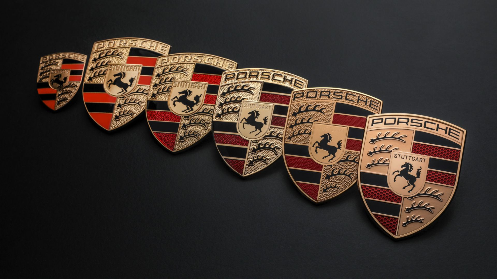
Today, the Porsche badge is familiar to just about anyone and regarded as a famous design in automotive history. However, its design was not on the first car of the brand in 1948; in the early years, all that was needed was simply the brand name which also happened to be the name of the founder. Thus the first cars had just ‘PORSCHE’ on the bonnet, believed to have been formed as individual aluminium letters by an apprentice.

However, there was a sense that perhaps something more graphic was needed and in 1951, a design competition was started by Dr. Ottomar Domnick, a film director and writer who was also a Porsche enthusiast. He offered ‘The Porsche Prize’ of 1,000 deutschemarks and invited submissions through the German art academies. None of the ideas appealed to Porsche’s management so the matter was set aside.

Max Hoffmann’s suggestion
At the end of the same year, Ferry Porsche (son of the founder, Ferdinand) was in New York having dinner with the company’s American distributor, Max Hoffmann, and the idea of designing a proper logo for the brand was brought up.
Though the era of the ‘Mad Men’ (the TV series( was in the 1960s, New York was where modern marketing, advertising and brand awareness was starting. So it was not unusual that Hoffmann felt that the brand needed a quality seal that would visually appeal to customers. He urged Ferry to develop a symbol for a unique identity that reflected the company’s roots and conveyed the quality and dynamism of its products.

An idea on a napkin
Ferry sketched his idea on a napkin and an entry in his notebook on December 27 recorded the following points: “Steering wheel rim decorated with ‘Porsche’ and the Stuttgart crest or similar.” He brought the idea (and the napkin) back to Germany, and passed to Franz Xaver Reimspiess, an engineer and senior designer at Porsche, who created the badge for the brand.
The design he came up with incorporated a horse, taken from the seal of the city of Stuttgart, depicted within the contours of a golden shield. The name of the Porsche’s home city of Stuttgart was inserted above it, while the surrounding red and black state colours and the stylised antlers were taken from the traditional crest of Württemberg-Hohenzollern. The Porsche logo formed a protective arch over everything else.

Some controversy too
The new badge was first seen on the steering wheel of the 356 in 1952; on hubcaps from 1959; and on the car bonnets only from 1965. Meaningful as it was, the new logo would also attract controversy. First, to understand what a detailed logo with many colours signified, it must be remembered that in the 1950s, colour printing was still very expensive, as well as complicated. Not every printer had suitable machines nor was it easy to create printing plates, or to set registration marks with precision so that all the print forms were positioned exactly on top of each other on letterheads and other business documents.

Creating a clear, sharp graphic or image without the print screen slipping was therefore tricky. Moreover, the Porsche crest didn’t look nearly as elegant as a stark black-and-white version. Porsche sales managers and the dealer organisation also saw another problem, which was addressed by writing to Porsche and its head of advertising, Hermann Lapper, in 1961: “The different colours and many details as a whole do not amount to a compact, coherent visual effect in road traffic.”
The Mercedes star and the VW logo (coincidentally also designed by Reimspiess) were presented as examples of good design. After this, a variety of designs were created in collaboration with Hanns Lohrer, a gifted commercial artist who was responsible for many influential posters and advertisements at Porsche in the 1950s and 1960s. It was to Lohrer that Porsche gave the task of creating a new logo. It was to be launched with the ‘T8 programme’, the successor to the 356 model. But nothing came of this.

Too established to change
There is uncertainty as to what the thinking of the management was at the time. It is presumed that a decision was made that the logo that had been in use since 1952 was already too established, and a sudden change of direction would not be a good idea. Ferry Porsche was known to have used this reasoning when someone suggested to him that, with its rearing horse, the Porsche crest was too similar to the logo of the Reutter coachbuilding company.

Design maintained for 71 years
And so the badge as we know it today would remain largely the same for 71 years, though there would be 5 changes in that time. These were evolutionary changes which were subtle and even with the latest one, introduced in June this year, you have to look very hard to see what has changed.
The product of 3 years, the new one is described as being modernised, with brushed precious metal with a more subtle gold colour, a 3-dimensional honeycomb structure and a ‘refreshed’ horse which was originally taken from the seal of the city of Stuttgart. It will appear on the sportscars and SUVs produced before the end of this year, starting with the new Panamera.

Find pre-owned Porsche models at Motor Trader Malaysia
